
The Fear That Produces Beige Rooms
A significant portion of residential interiors are decorated in variations of beige, greige, and white — not because the occupants genuinely prefer these tones above all others, but because they’re afraid of choosing a color and getting it wrong. The permanence of a paint decision, the expense of reupholstering in the wrong hue, the uncertainty of what goes with what — these anxieties produce safe, unengaging interiors by default.
The practical path into color doesn’t require a bold commitment. It requires understanding the entry points — the low-risk, low-permanence ways to introduce color that let you test your response before investing in anything difficult to change.
Start With Textiles: The Lowest-Risk Entry
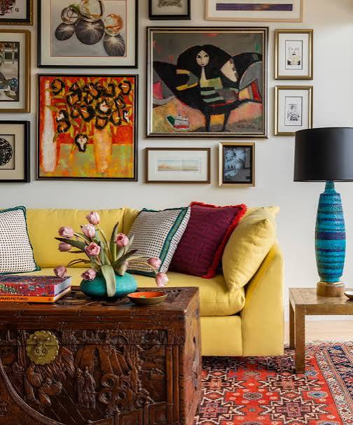
Throw pillows, throws, and table textiles are the lowest-commitment color introduction available. A set of cushion covers in a color you’re curious about costs $20–$60, changes the character of a room immediately, and can be replaced or returned without any lasting consequence. This is color experimentation with essentially zero risk.
The exercise: choose one color you’re drawn to but wouldn’t typically use — a terracotta orange, a sage green, a dusty blue. Buy two to three cushion covers in that color and live with them in your room for two weeks. Pay attention to how the color makes you feel in the morning light, in the evening, and against your existing furniture. This direct experience is more informative than any swatch comparison in a store.
The 70-Year Color Rule: Why Certain Combinations Always Work
The colors that appear together repeatedly in nature — the tones that co-exist in a garden, a landscape, a beach — are the colors that human perception experiences as harmonious without cognitive effort. Sage green and terra cotta exist together in Mediterranean landscapes. Navy and warm white exist together at coastal environments. Mustard and rust exist together in autumn foliage.
Starting with a nature-derived color palette eliminates the fear of combinations that don’t work because the work has been done by evolutionary color perception over millennia. Pick a natural environment you find beautiful and extract its two or three dominant tones — these are safe, proven companions regardless of how unusual they seem as interior paint or furnishing choices.
One Colorful Piece as an Anchor
An alternative to room-wide color commitment: choose one piece in a room to carry a strong color and keep everything else neutral. A sapphire blue velvet armchair in a room that’s otherwise warm white and natural wood becomes the room’s statement without requiring any other color decision. A deep green linen sofa in a white room with warm wood floors makes the sofa the feature without the risk of color coordination across multiple pieces.
This approach works because the single colorful piece becomes the visual anchor that everything else relates to. It’s easier to choose neutrals that complement one specific color than to balance multiple colors against each other. And if the color eventually stops appealing, changing one piece is far less disruptive than a whole-room palette revision.
The Role of Color in Adjacent Rooms
In open-plan homes or homes where rooms are visible from each other, color choices in adjacent spaces interact. A room painted in a warm terracotta that opens into a hallway painted in cool gray creates a jarring color temperature shift that makes both spaces feel less resolved than either would alone. Rooms that flow visually into each other need colors that are at least in the same temperature family (both warm or both cool) even if they’re not the same color.
The practical approach: choose your most important room’s color first, then select colors for adjacent spaces that share the same undertone. A warm white with yellow undertones in the main room flows into a warm sage green in an adjacent space; a cool white with gray undertones flows into a cool dusty blue. The temperature consistency allows each room to have its own identity while the transitions between them feel harmonious.